
The Power of Color Psychology: Shaping Hotel Guest Experiences
Why Color Psychology is the Secret Weapon in Hotel & Resort Design
In the competitive world of hospitality, first impressions are everything—and mood and tone are often the first thing guests notice. Color psychology goes beyond aesthetics; it’s a strategic tool that influences how people feel, behave, and remember their experience. From tranquil blues that calm the mind in spa areas to energizing oranges in social zones, each shade can subtly shape the mood and atmosphere.
In hotels and resorts, this means the difference between a stay that’s simply pleasant and one that’s truly unforgettable. By using colors that align with your identity and guest expectations, you create immersive spaces that feel curated, comfortable, and emotionally resonant.
At Whitespace, one of the most effective tools we use is color psychology for strong concepts. Tone isn’t just about aesthetics—it’s a strategic asset that influences perception, emotion, and behavior. The right palette can evoke trust, spark excitement, or create a sense of calm, depending on your brand’s purpose. Whether you’re a wellness retreat aiming to soothe or a vibrant co-working space looking to energize, we align shade choices with your strategy to create meaningful emotional connections.
Our Brand Concept service is designed to uncover that unique identity and express it through every detail of your presence. From visual language to spatial experience, we help bring your story to life in a way that resonates deeply with your audience.
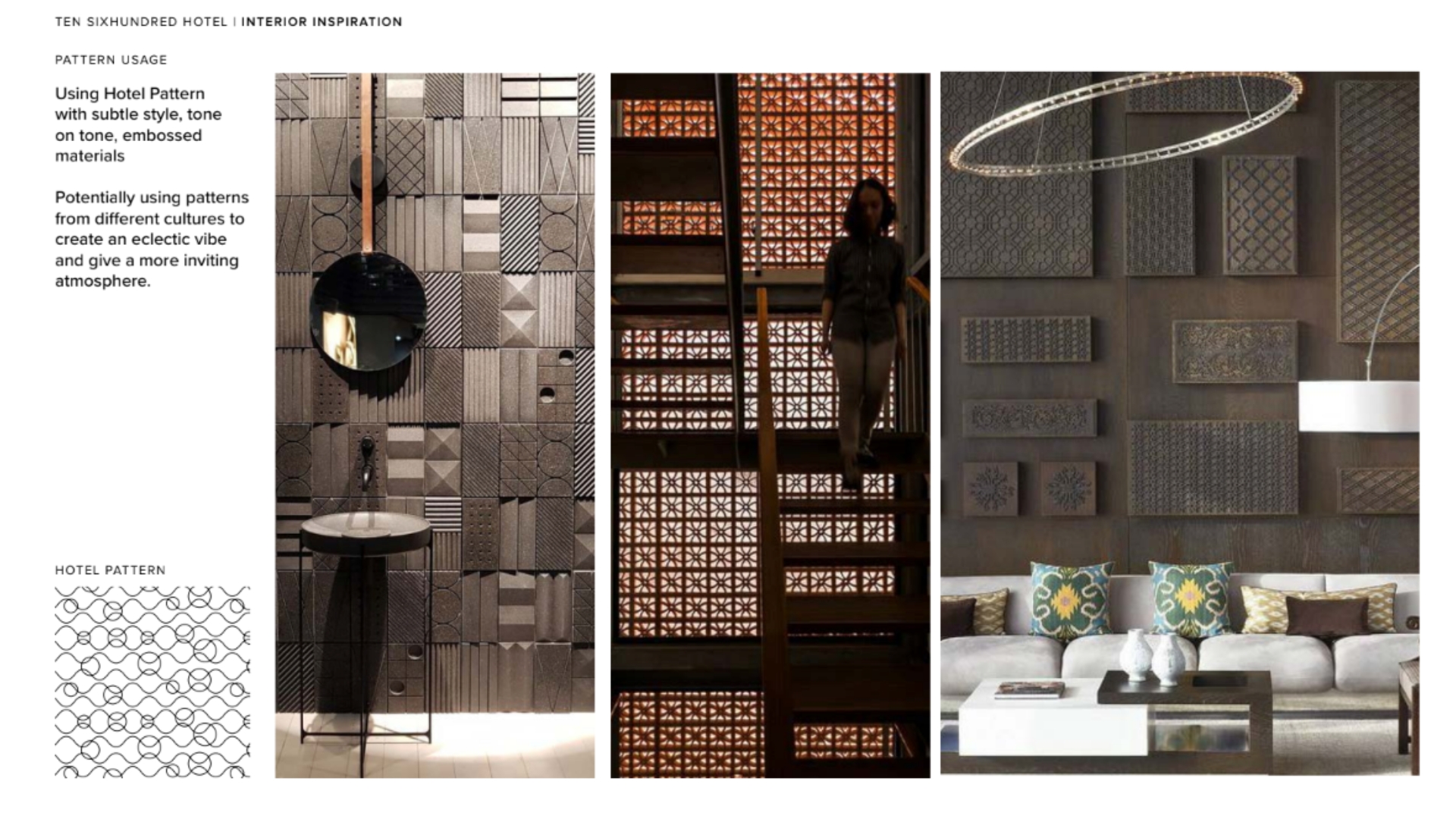
A well-crafted brand concept we had the opportunity to design is Ten Six Hundred, a luxury hotel in Bangkok. We helped define its identity through logo variations, a cohesive tone palette, a custom typography system, and distinctive brand patterns.
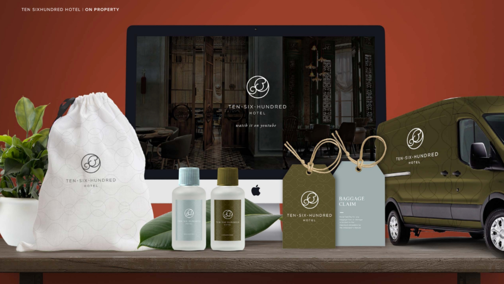
Every element was intentionally crafted to reflect the refined elegance and modern sophistication of Ten Six Hundred. From the sleek lines of the logo to the rich tones that evoke a sense of understated luxury, the identity concept was built to resonate with high-end travelers seeking a unique Bangkok experience. The typography and patterns not only add visual interest but also help communicate the hotel’s story—one of exclusivity, comfort, and timeless design.
Colors and Emotions: The Hidden Dialogue in Every Design
Color is more than just a visual element—it’s a silent language that speaks directly to our emotions. In design, the right palette can transform how people feel, behave, and remember a space or identity. Warm tones like red and orange can spark excitement and urgency, while cool hues like blue and green promote calmness and trust. Every shade evokes a subconscious response, guiding moods, decisions, and even brand loyalty.
In interior and brand design, understanding this emotional connection is crucial. Whether it’s a serene hotel lobby, a vibrant retail space, or a minimalist identity, it becomes the invisible thread tying together aesthetics and emotion. It’s not just about what looks good—it’s about what feels right.
At the heart of impactful design lies this hidden dialogue between color and feeling. When used with intention, color psychology doesn’t just enhance visual appeal—it creates deeper, more meaningful connections with your audience.
One standout example is Somerset where Whitespace revitalized the Somerset with a fresh, forward-looking spirit—infusing it with meaningful experiences that celebrate sustainable travel and bring multi-generational families closer together.
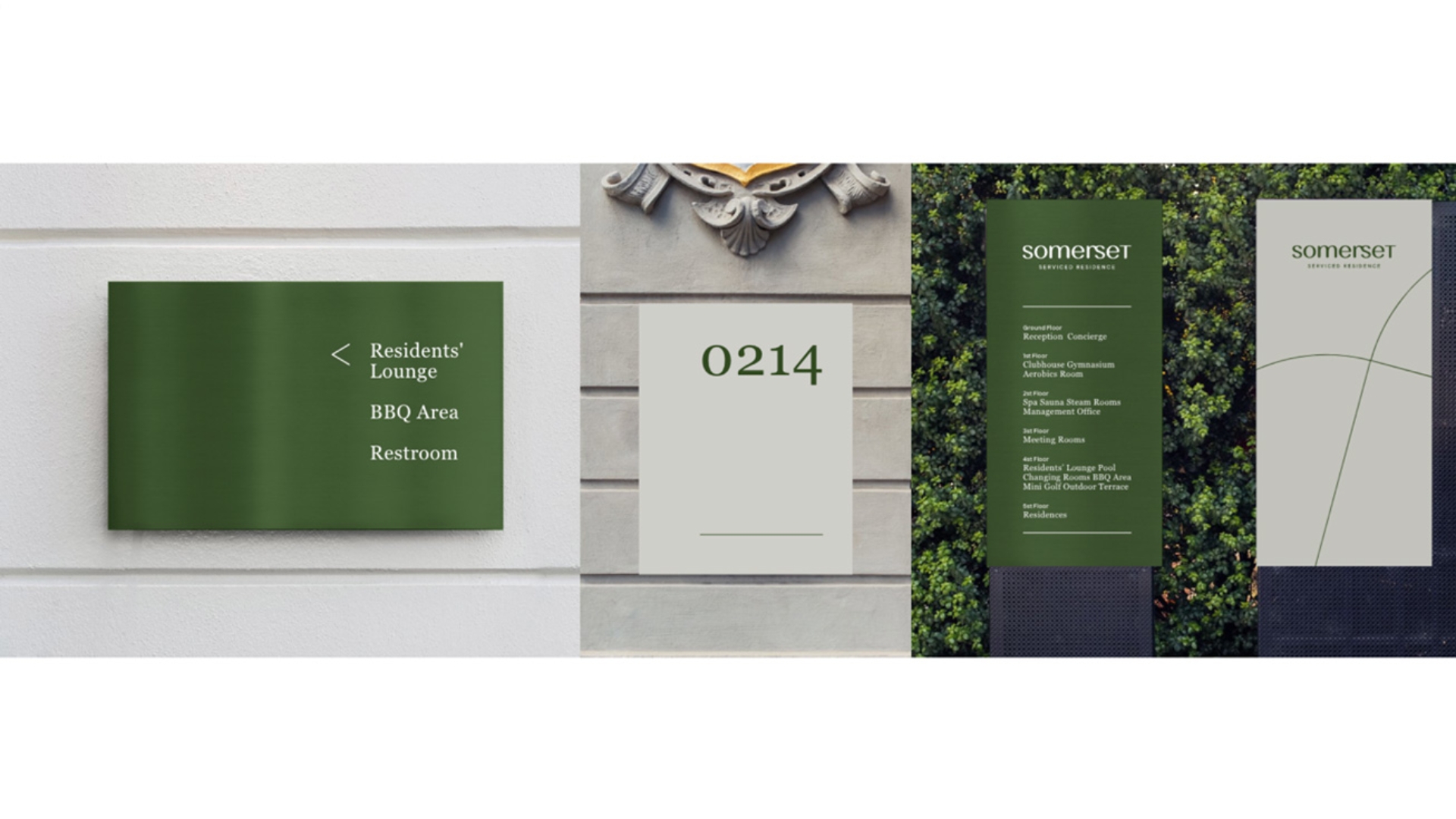
Whitespace deep understanding of the delicate balance between personal comfort and professional needs. Each environment they craft reflects a belief in the transformative power of space—where layout not only looks beautiful but also enriches everyday living. With a thoughtful approach rooted in both pragmatism and well-being, Whitespace redefines the hotel experience, creating spaces that align seamlessly with the dynamic, harmonious lifestyles of today’s travelers.
Successful hotel and resort design is all about storytelling—and tone is one of the most powerful narrators. Whether it’s a rich, earthy palette that evokes warmth and grounding in a mountain retreat, or soft neutrals that signal luxury and calm in an urban boutique hotel, colors speak directly to the subconscious. They help define zones, guide movement, and reinforce identity without saying a word. When thoughtfully applied, color transforms ordinary spaces into memorable destinations that leave lasting emotional impressions—inviting guests not just to stay, but to feel.
Designing with Feeling: Why Mood and Tone Matter More Than Ever
In today’s design landscape, mood and tone are no longer just finishing touches—they’re the foundation of meaningful experiences. Whether in branding, interior spaces, or digital platforms, these emotional cues guide how people feel, react, and remember. A well-crafted mood can create a sense of calm, excitement, or inspiration, while the right tone ensures that every element—from lighting to typography and texture—speaks in harmony.
Designing with feeling means going beyond surface beauty to craft a deeper, more intuitive connection between space and user. It’s about understanding human behavior, cultural context, and emotional nuance to create environments and identities that truly resonate. In a world where attention is fleeting, mood and tone help build authenticity and trust—making them essential tools in shaping unforgettable experiences.
In the world of successful hotels and resorts, mood and tone aren’t just details—they are the soul of the experience. From the moment guests arrive, the atmosphere shapes their perception, emotions, and memories. A serene coastal resort might embrace natural textures, soft lighting, and calming hues to evoke tranquility, while a chic urban hotel might lean into bold contrasts, curated art, and sophisticated materials to spark excitement and energy.
Designing with feeling allows hotels and resorts to create a deep emotional resonance that sets them apart. It’s not just about aesthetics—it’s about storytelling. When every choice, from palette to soundscape, reflects the brand’s personality and the guest’s desired mood, the result is a space that feels personal, memorable, and worthy of return. Mood and tone, when thoughtfully applied, become the silent hosts that guide, comfort, and delight.
Incorporating color psychology into your design approach doesn’t just elevate the look of a space—it enhances every moment of the guest journey.